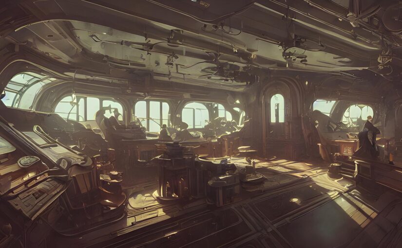
Well, I have been playing around with the image-generation AI for a while now. I have passed the “introduction” stage, and am nor in the “novice user” stage.
I have been focusing my attention on one particular program known as DeepAI.
I have bought some “AI call” time, and been “mucking around” with it. This is what I have learned about this one particular type of image AI generation software…
- Each time you click on the generation button”, a new picture is generated. Even if the rest of the settings stay the same. No two images are the same.
- Word text description orientation makes a big difference.
Big grey elephant with monkey riding on top
Will have a very different image result than…
Monkey riding on top of a big grey elephant
- Make sure you spell things properly. Steel is different than steal. A spelling mistake can have substantial impact on your resultant art.
- The simple sentence will generate “pure” drawings, while the complicated description will provide more accurate results.
- The art seems to generate some kind of “feel” for the imagery that you detail out, not any actual anatomical, or functional details.
- The image context “style” groupings make all the difference in the world.
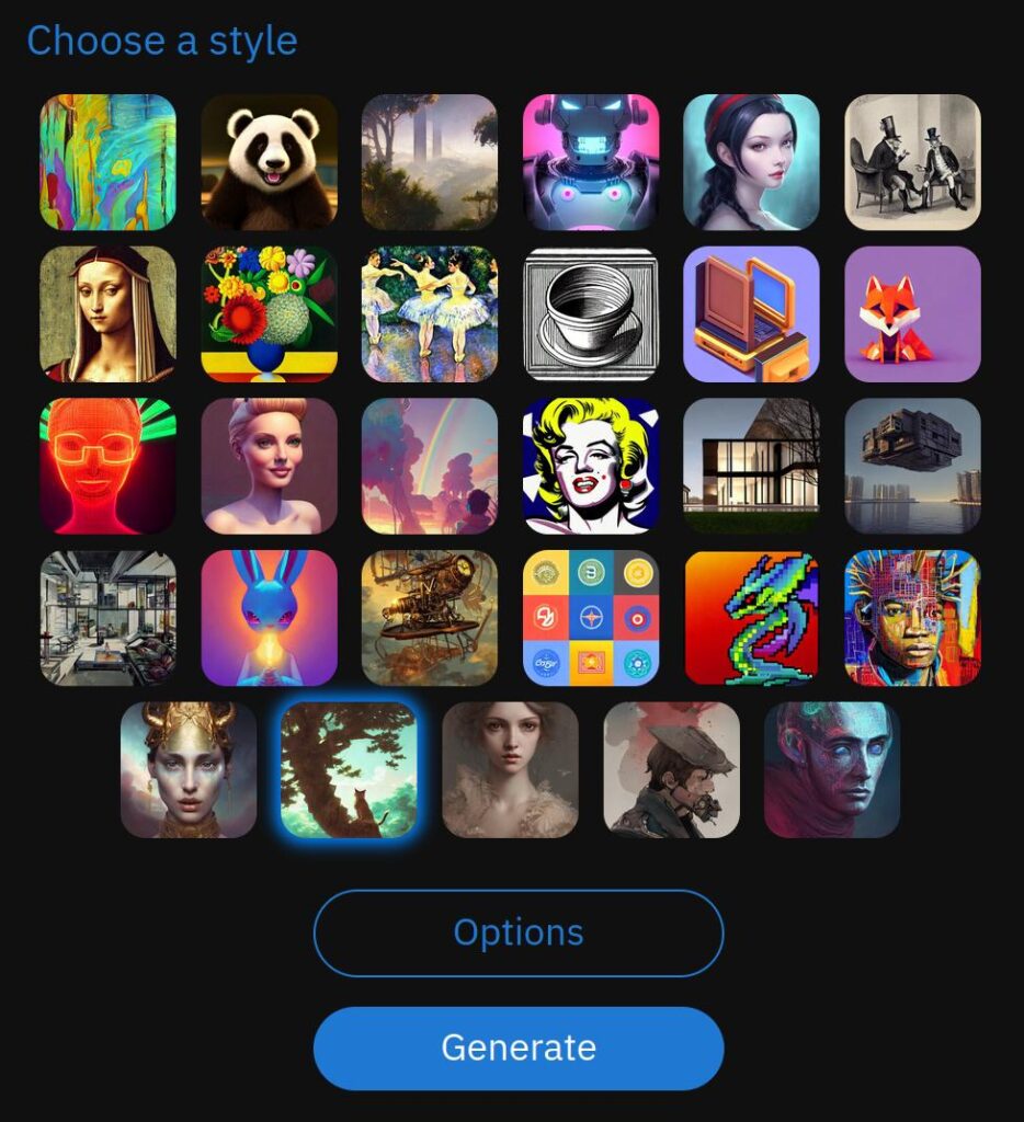
Quick note; Double Click on the images to see the full size.
Example – Spaceship interior
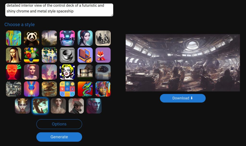
In this example, I have created a text that looks like this…
detailed interior view of the control deck of a futuristic and shiny chrome and metal style spaceship
And the screen will look like this…
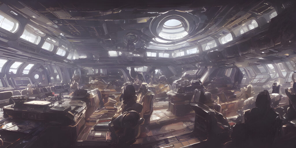
Resulting in the following images… very futuristic, and stylish. Reminds me a little of the spacecraft in the movie “Alien”.
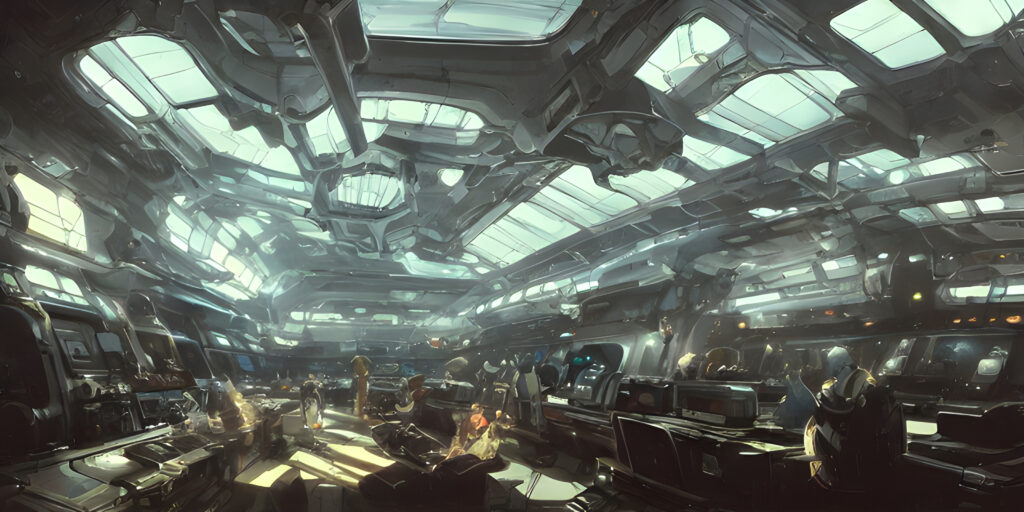
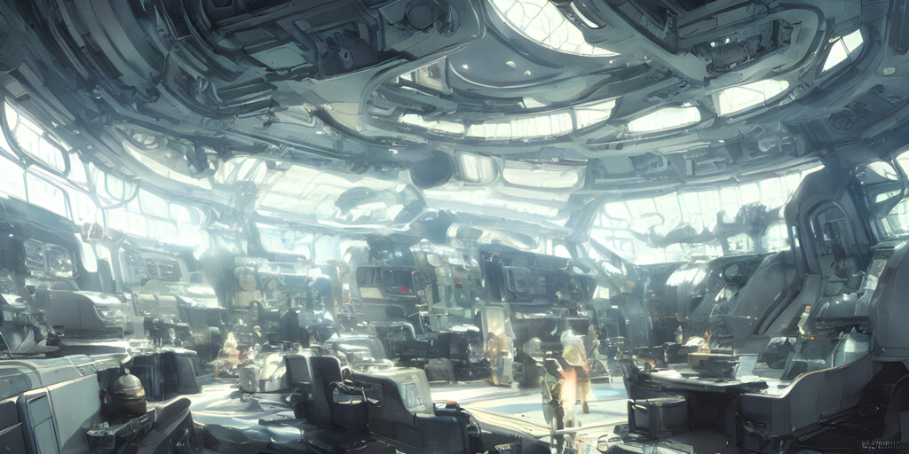
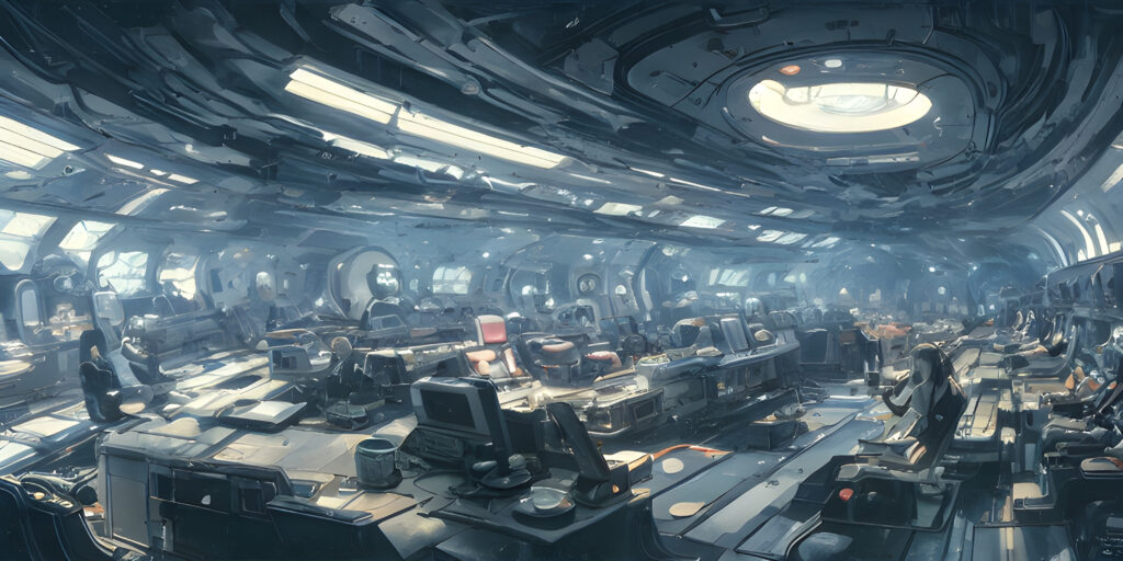
Now, I then went and changed some wording. What I intended “black lit” was obviously not understood by the AI ‘Bot. I wanted to have a kind of “2001 space odyssey” kind of interior.
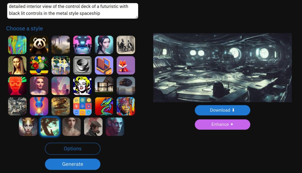
Resulting in the following images… not really what I intended. But pretty cool. Anyways.
detailed interior view of the control deck of a futuristic and shiny chrome with black lit controls in a metal style spaceship
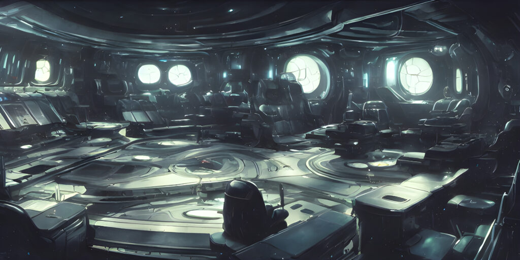
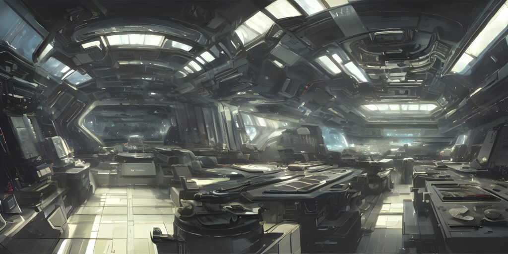
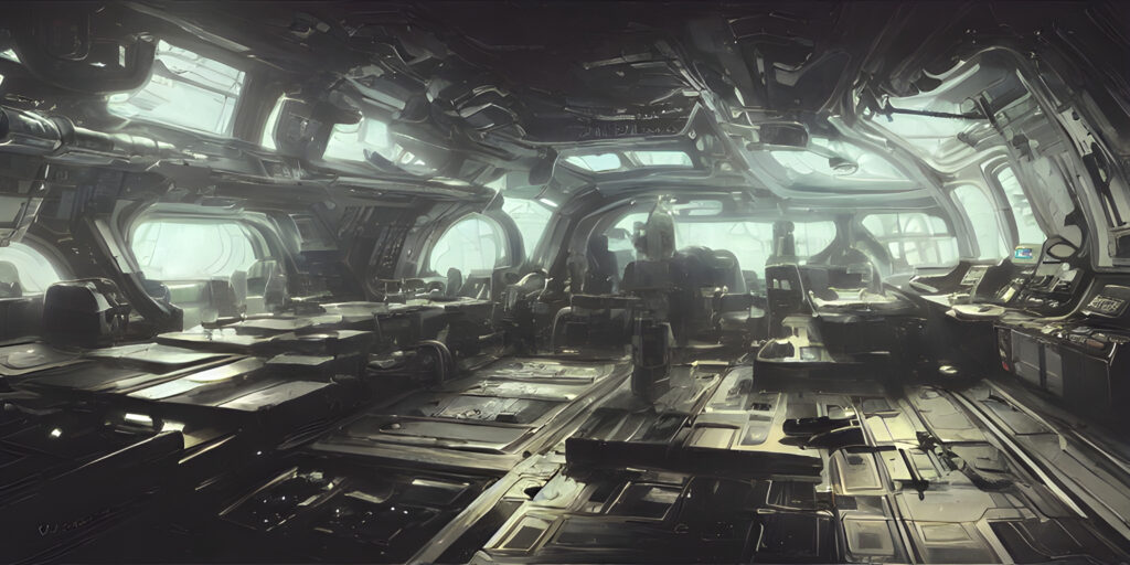
Whoops!
I should of said “Back lit” instead of “black lit”.
Oh well…
Make a change…
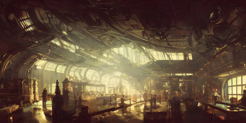
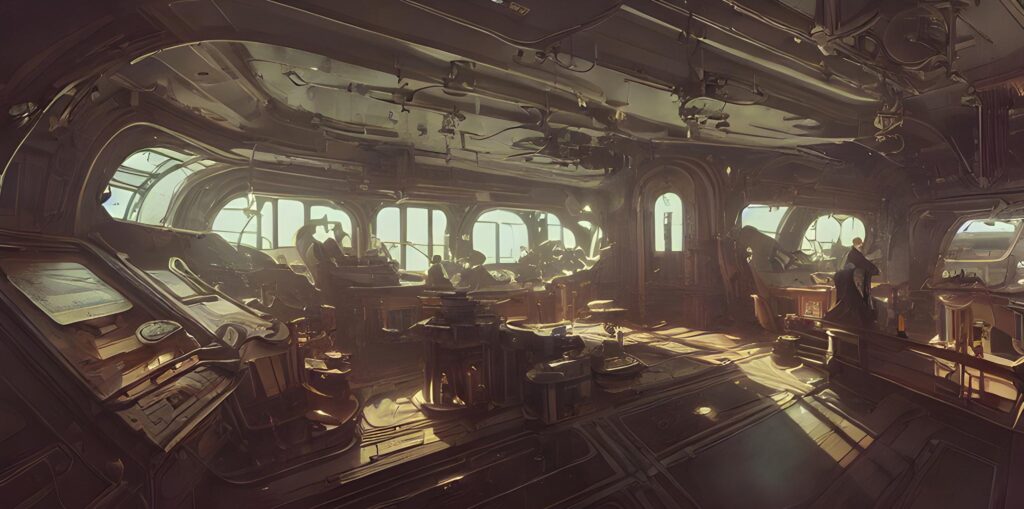
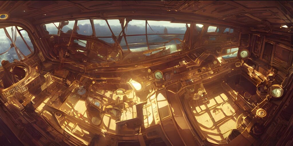
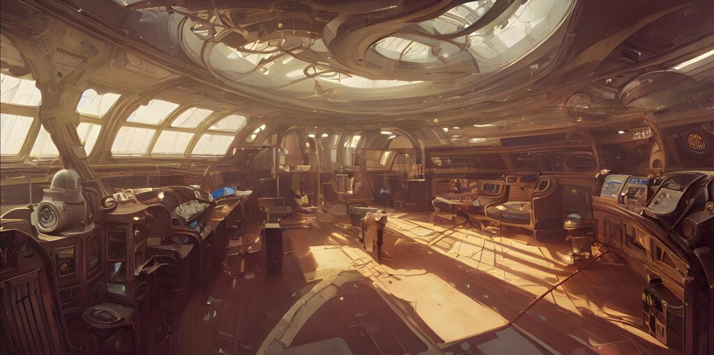
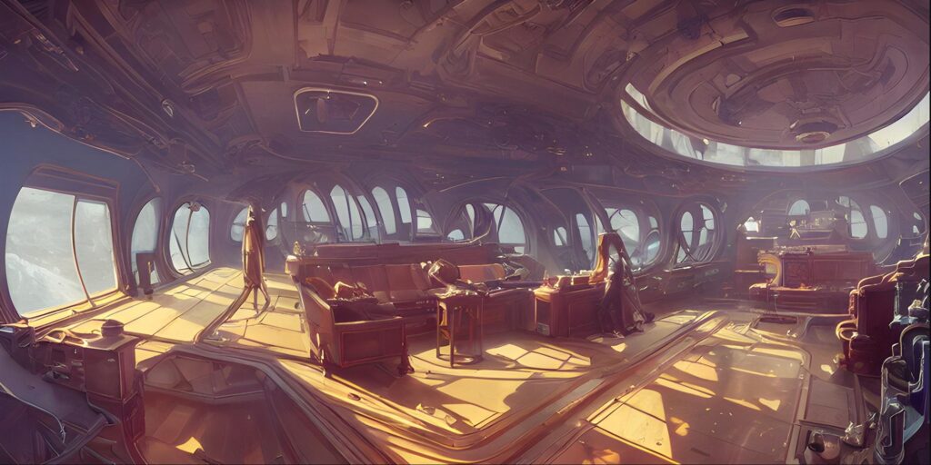
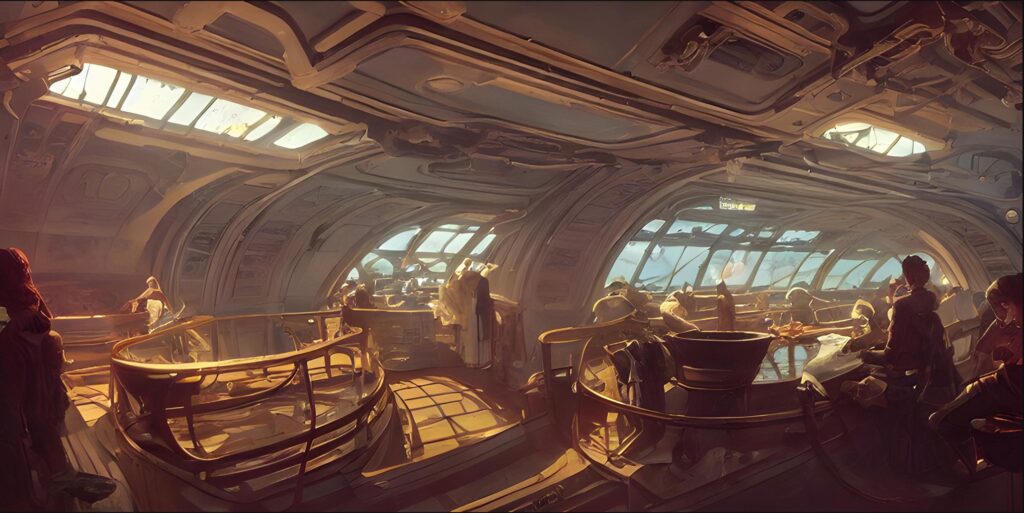
Jules Verne style.
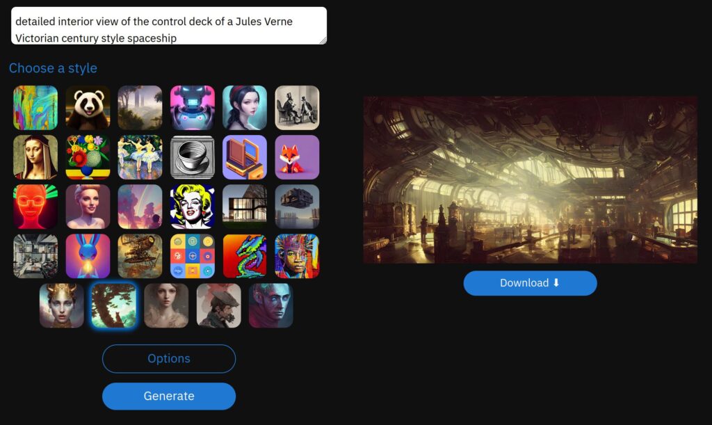
With this… very interesting. You do get the “feel” of Victorian science fiction.
detailed interior view of the control deck of a Jules Verne Victorian century style spaceship
Make the following changes…
From this…
detailed interior view of the control deck of a Jules Verne Victorian century style spaceship
To this…
detailed interior view of the control deck of a Jules Verne Victorian century style spaceship. Outside the view ports and widows is a brilliant blue sky with white fluffy clouds and bright morning sun.
Resulting in… this very beautiful and interesting drawing.
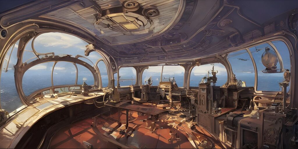
And some more… looks good with the blue skies, eh?
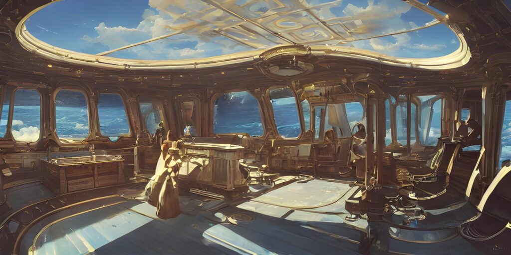
More…
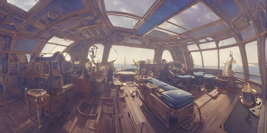
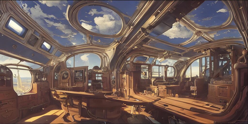
Let’s jazz up the interior some…
Let’s add brass, and red velvet.
detailed interior view of the control deck of a Jules Verne Victorian century style spaceship. Outside the view ports and widows is a brilliant blue sky with white fluffy clouds and bright morning sun. The interior is one of brass, and red velvet.
And look at the interior now… damn!
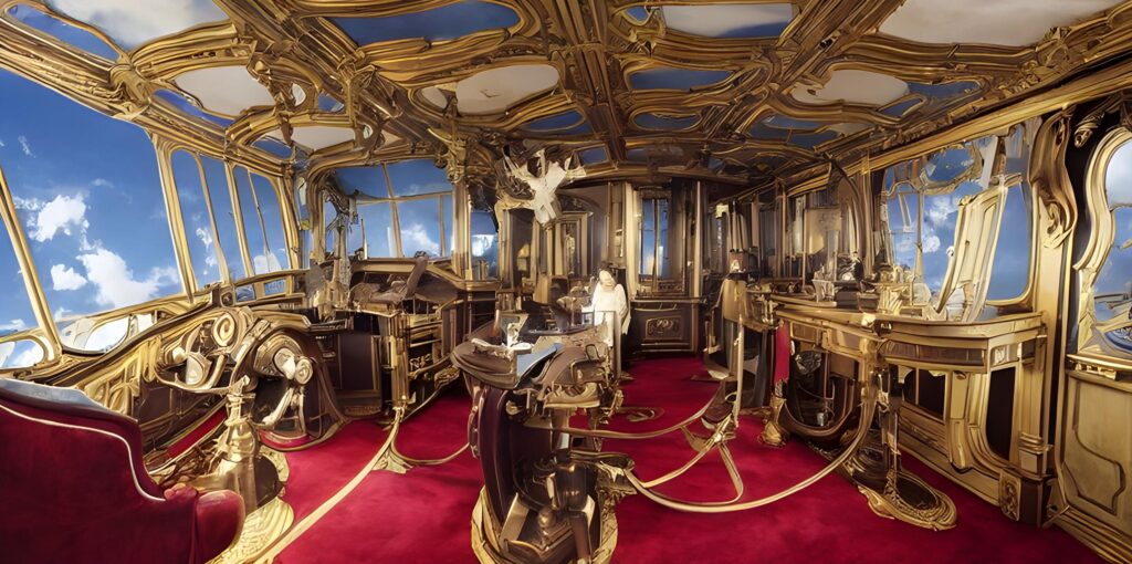
But, of course, some of the results can be really unexpected…
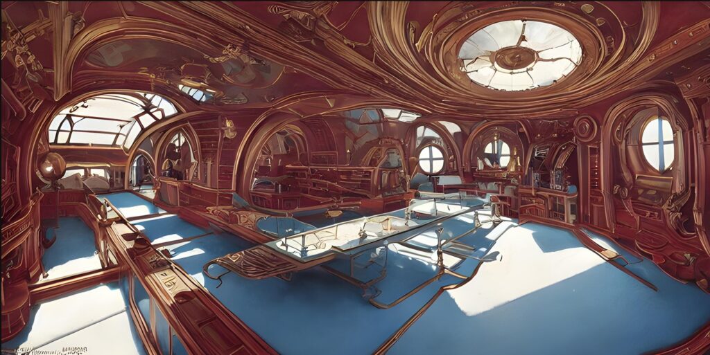
My gosh! Check out this one!
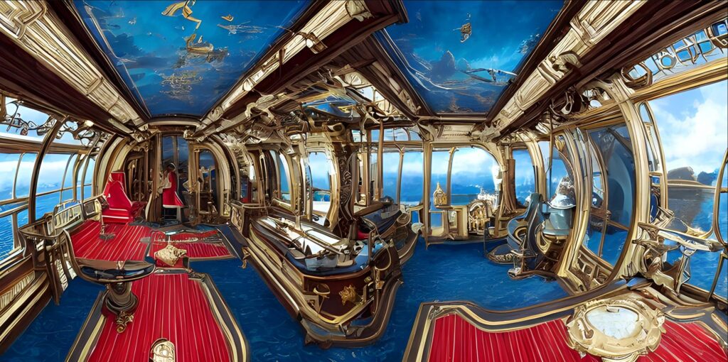
And this one…
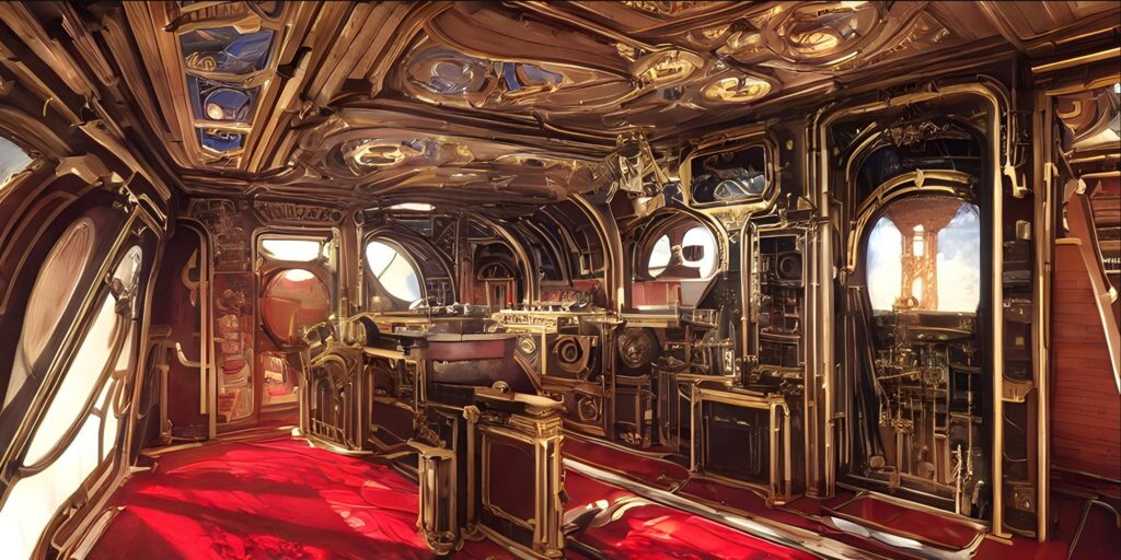
The images build upon each other, as you can see in this train of images.
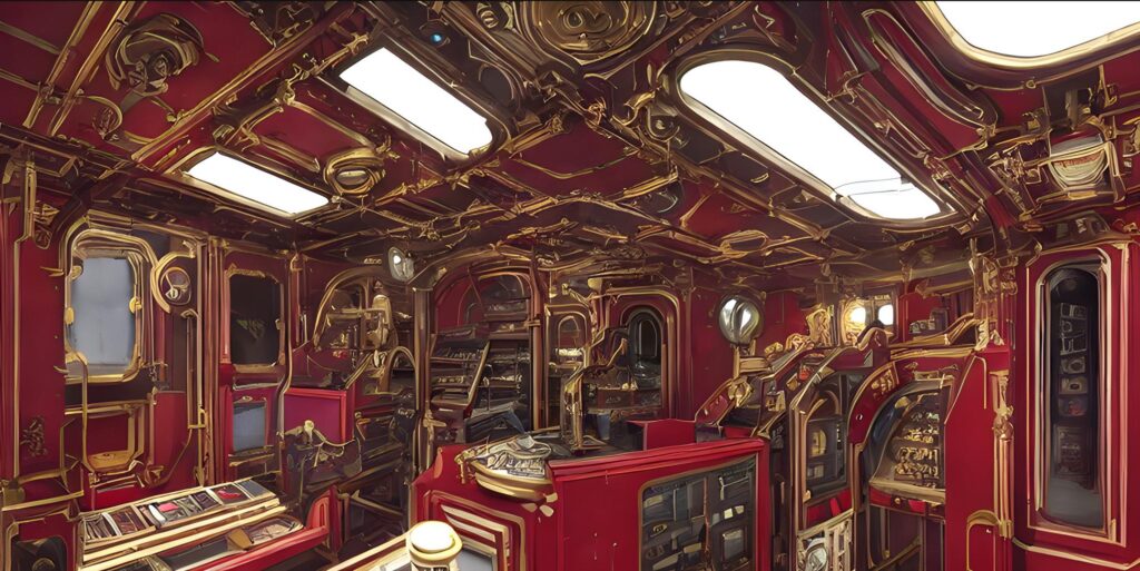
Let’s further refine the description…
From
detailed interior view of the control deck of a Jules Verne Victorian century style spaceship. Outside the view ports and widows is a brilliant blue sky with white fluffy clouds and bright morning sun. The interior is one of brass, and red velvet.
To
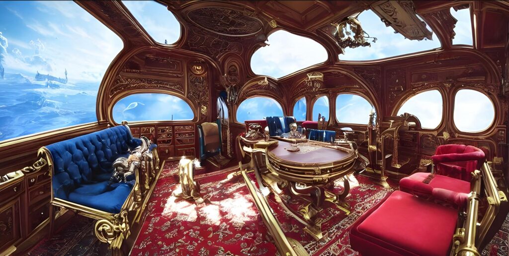
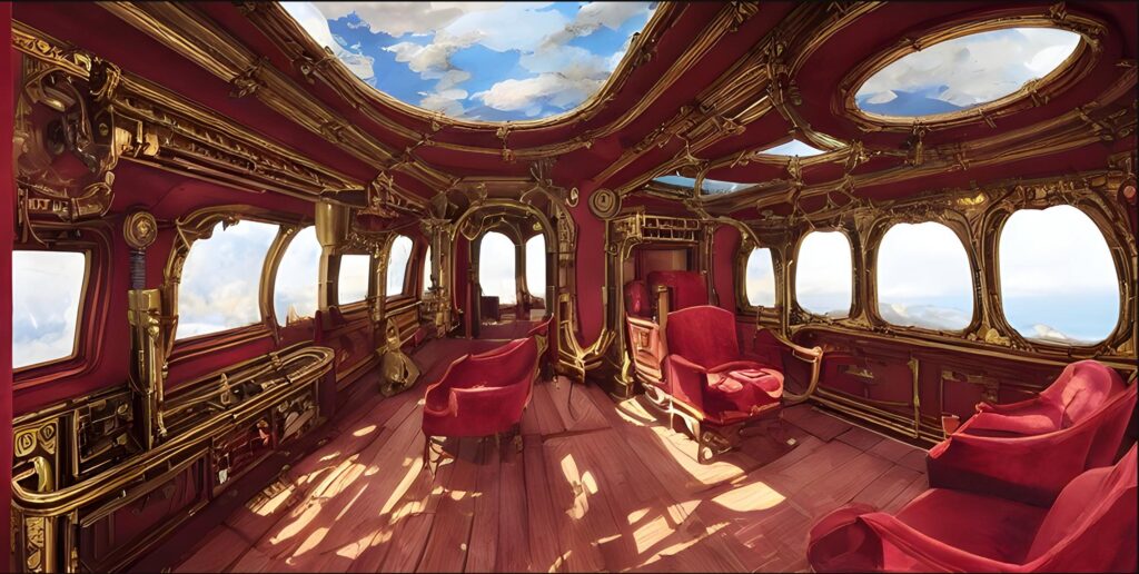
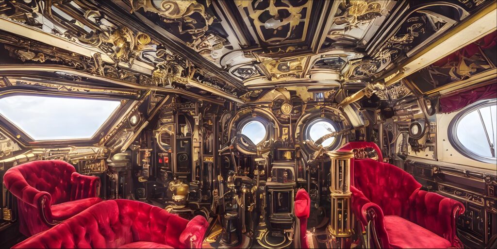
detailed interior view of the control deck of a Jules Verne Victorian century style spaceship. Outside the many big view ports and wide widows is a brilliant blue sky with white fluffy clouds and bright morning sun. The interior is one of brass, and red velvet. leather chairs. Many levers and switches.
And it’s getting closer and pretty impressive.
.
Let’s add some carved ivory handles…
Let’s make this change.
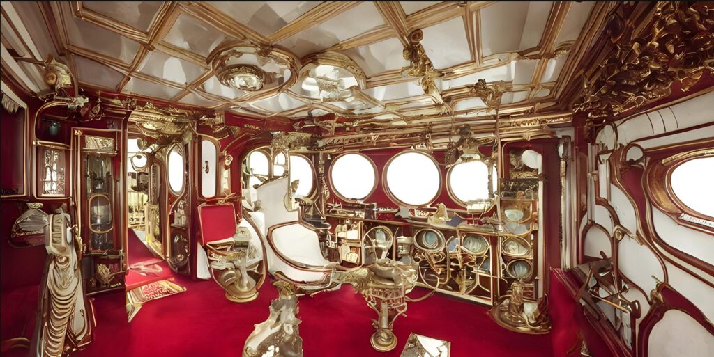
detailed interior view of the control deck of a Jules Verne Victorian century style spaceship. Outside the many big view ports and wide widows is a brilliant blue sky with white fluffy clouds and bright morning sun. The interior is one of brass, and red velvet. leather chairs. Many levers and switches. There are white carved ivory handles for the doors, switches and fixtures.
Let’s do something radical…
It’s going in a direction that I am not that interested in. Let’s change the description.
From
detailed interior view of the control deck of a Jules Verne Victorian century style spaceship. Outside the many big view ports and wide widows is a brilliant blue sky with white fluffy clouds and bright morning sun. The interior is one of brass, and red velvet. leather chairs. Many levers and switches. There are white carved ivory handles for the doors, switches and fixtures.
To
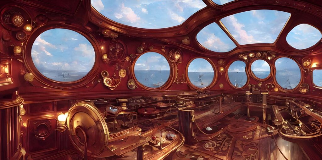
detailed interior view of the control deck of a Jules Verne Victorian century style spaceship. Outside the many big view ports and wide widows is a stormy and rainy sky. The interior is one of brass, and red velvet.
Resulting in this…
More playing with changes…
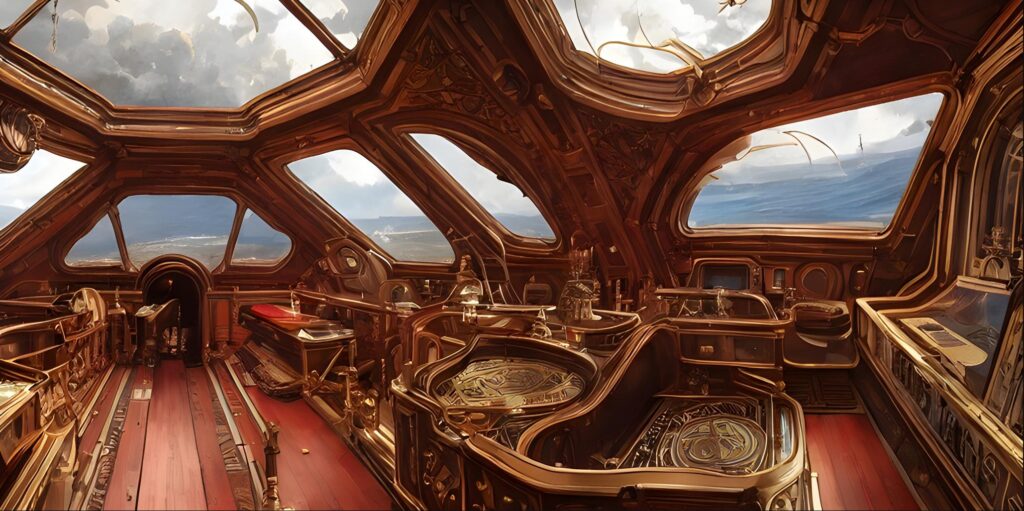
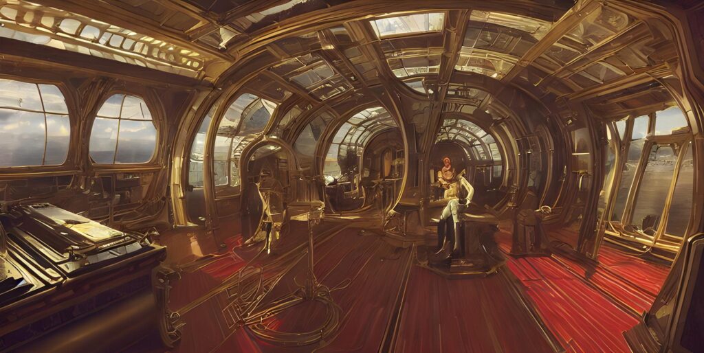
detailed interior view of the control deck of a Jules Verne Victorian century style spaceship. Outside the many big view ports and wide widows is a brilliant morning sky. The interior is one of brass, polished wood, and red velvet.
Resulting in this…
Changing the style…
As in this image displays…
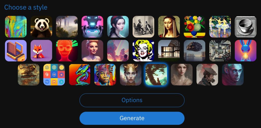
Results in this…
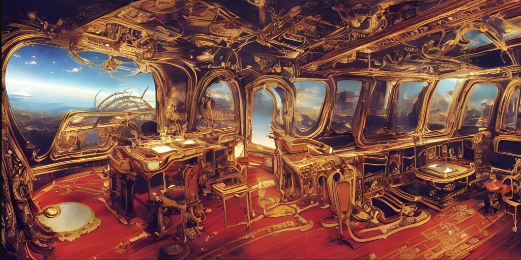
Pretty impressive, though all the details are sketchy and there really isn’t any conformity in Industrial Design…
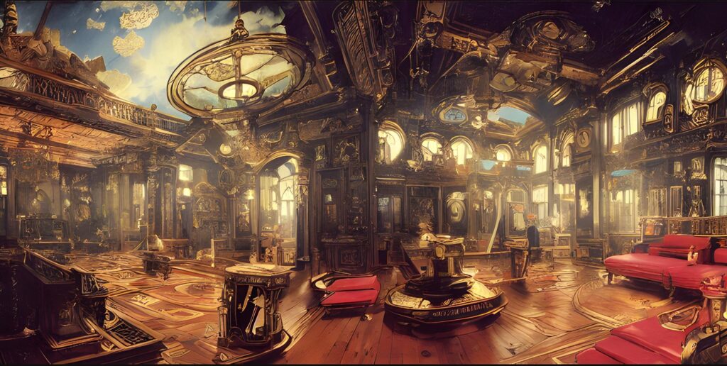
And…
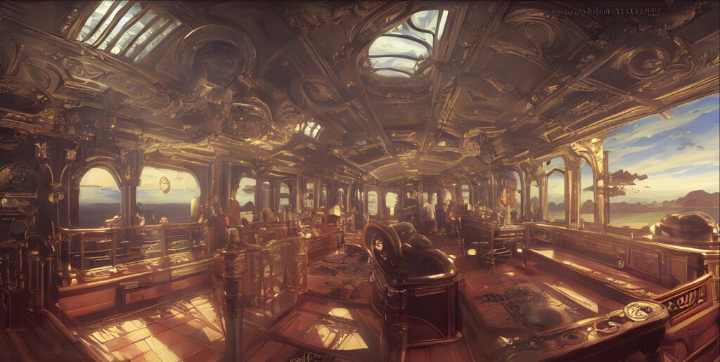
It can also make very beautiful, but complex and nonsensical images…
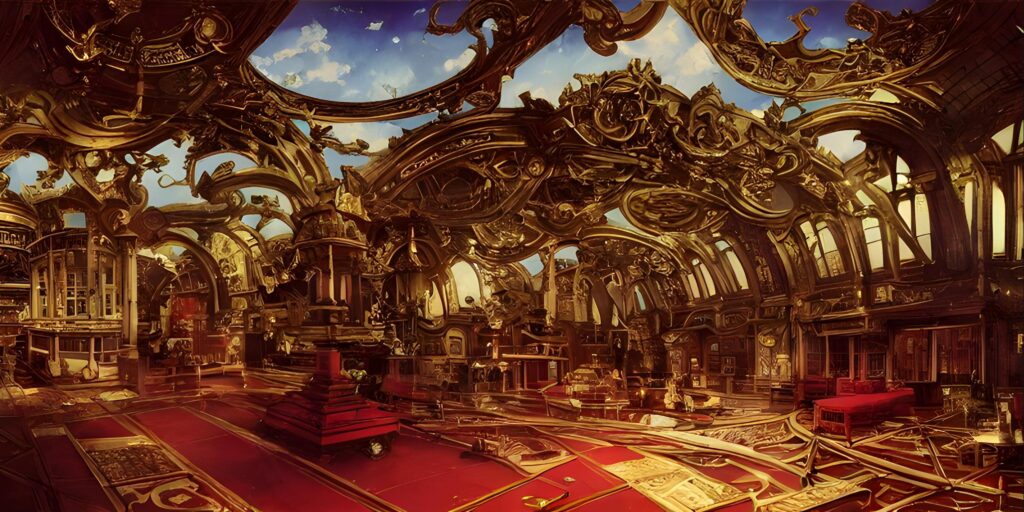
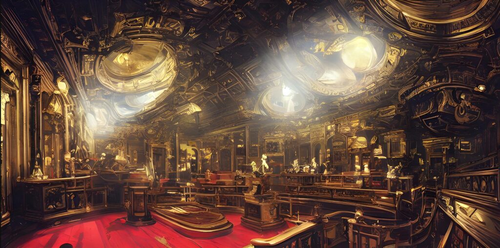
Another alteration to the text…
Let’s try this, shall we…
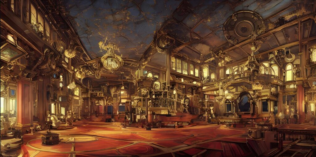
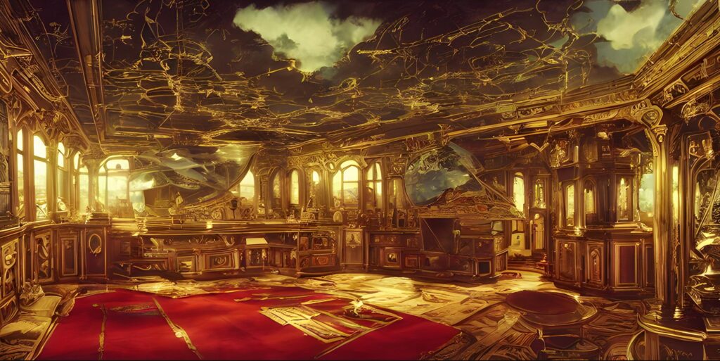
detailed interior view of the control deck of a Jules Verne Victorian century style spaceship. Outside the many big view ports and wide widows is a brilliant morning sky overlooking lush green hills. The interior is one of brass, polished wood, and red velvet.
Resulting in…
Another change…
Adding a cupola bubble.
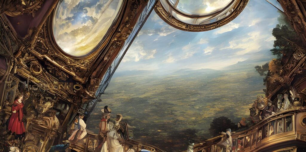
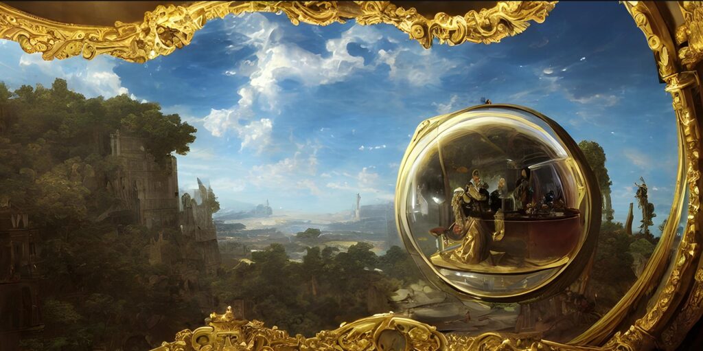
A view from the observation cupola bubble that is part of detailed interior view of the control deck of a Jules Verne Victorian century style spaceship. Outside the many big view ports and wide widows is a brilliant morning sky overlooking lush green hills. The interior is one of brass, polished wood, and red velvet.
Resulting in…what?
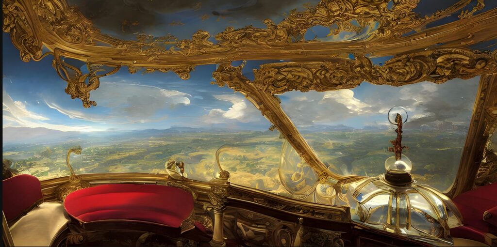
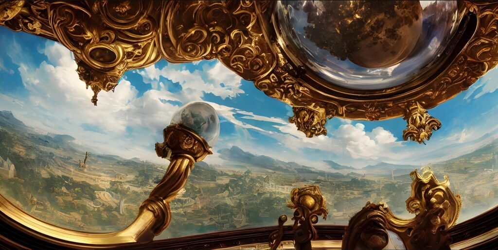
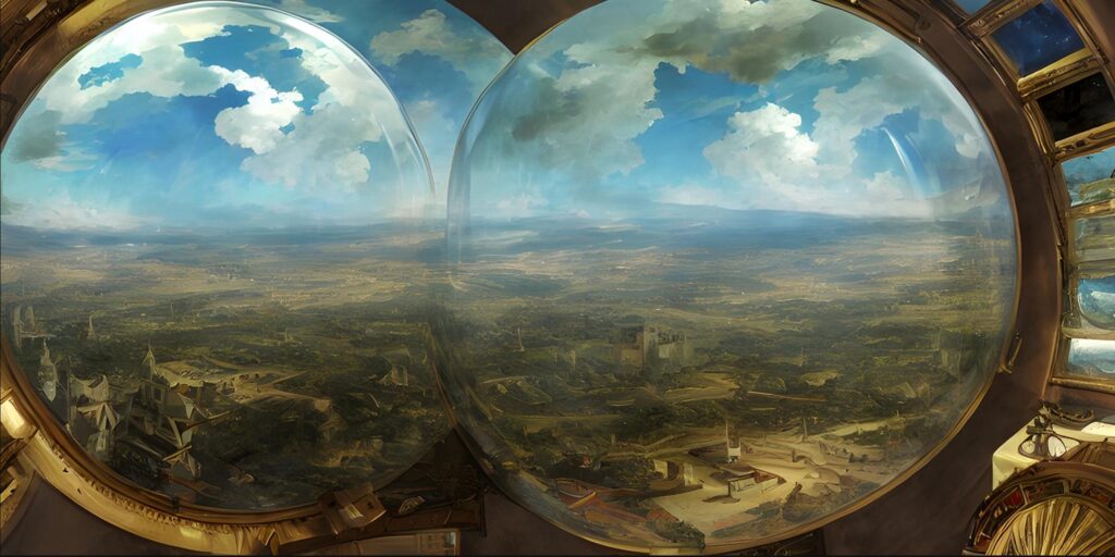
Sigh.
I think that you all can get a “feel” for how this systems works. Right?
A view from the Palaeozoic period
New attempt. Different subject area.
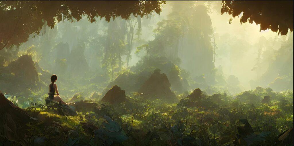
Next try…
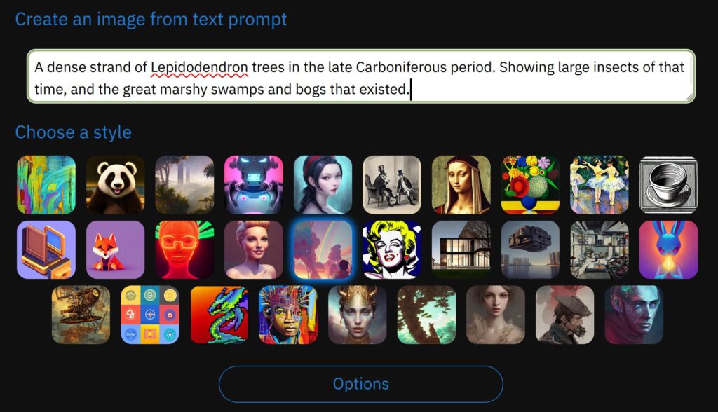
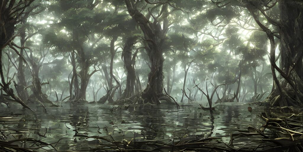
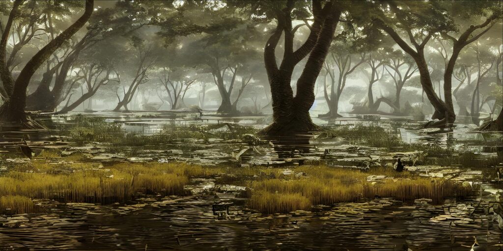
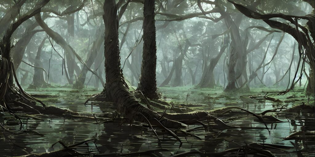
Back to Basics…
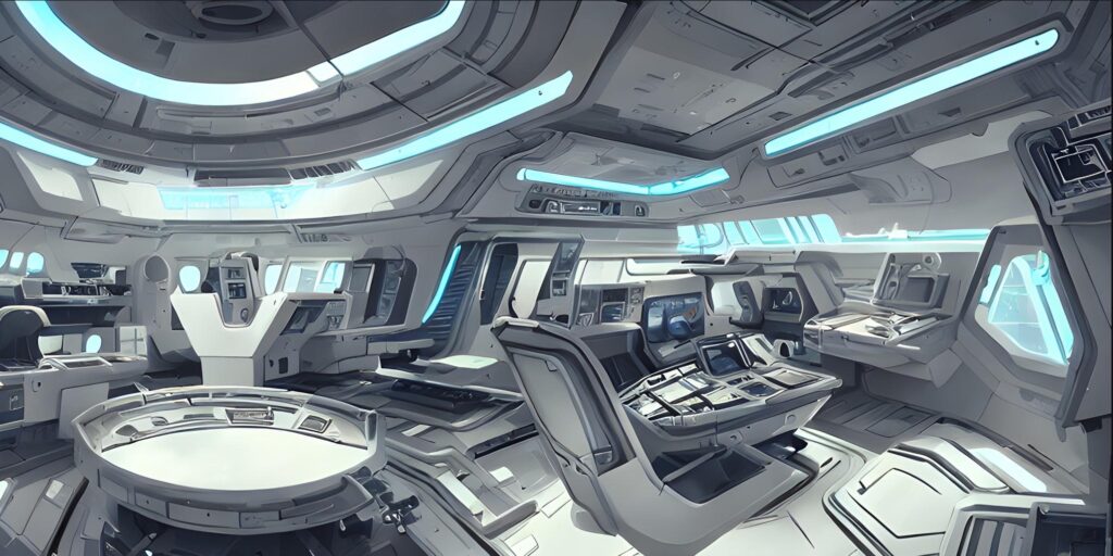
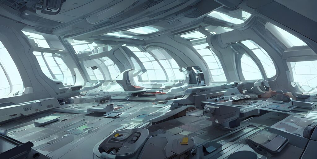
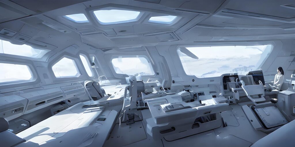
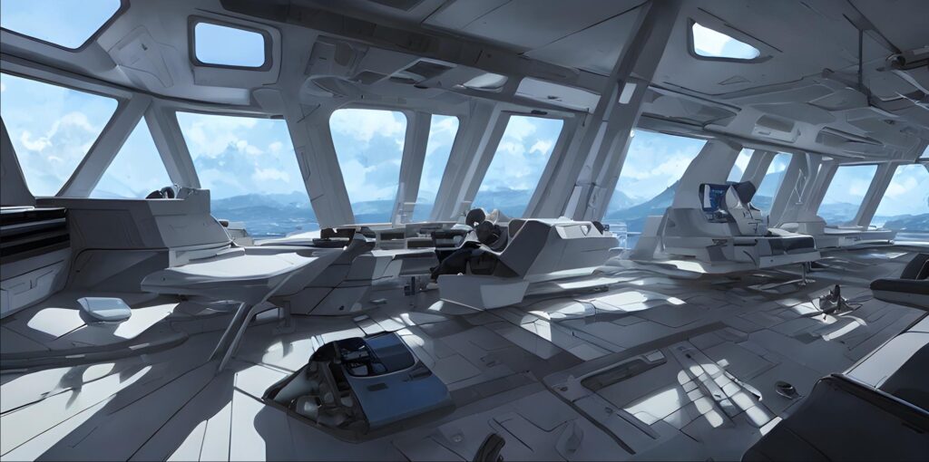
We revisit the initial statement with an add-on, and removed the requirement of metal.
detailed interior view of the control deck of a futuristic style spaceship. the interior is clean and organized
Resulting in…
And now let’s make yet another change…
detailed interior view of the control deck of a futuristic style spaceship. the interior is clean and organized. The walls are brushed and anodized aluminum, the controls are back-lit.
Conclusion
I have started playing with this software and find it has potential. You are able to effortlessly create your own royalty free art to illustrate your projects instead of paying for images, or using the tired old “internet” art.
That being said, it’s a cantankerous beast. You have to run through many iterations before you can find anything usable.
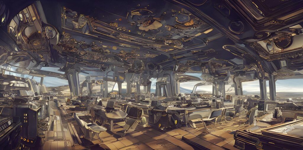
In this example, I tried to obtain a spaceship interior, but none of the generated art fit my notions of what it should be. Though the art was in many cases spectacular, more practice must be mastered before it can be of any use.
I will tell the reader that I continue to play with this software and I will have further reports in the future.
